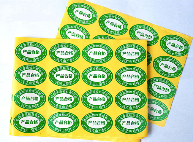
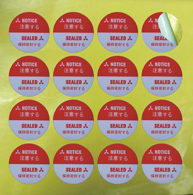
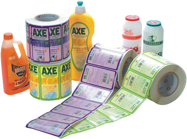
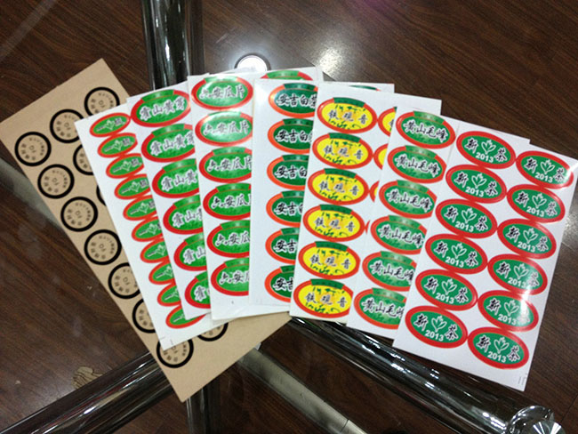
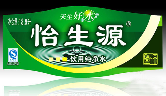
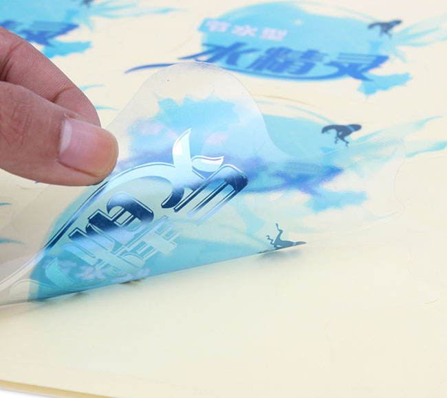
您身邊的印刷服務(wù)商
一站式定制印刷解決方案

13698644688
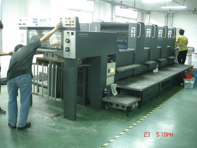
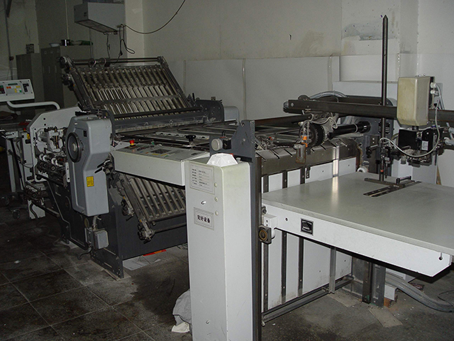
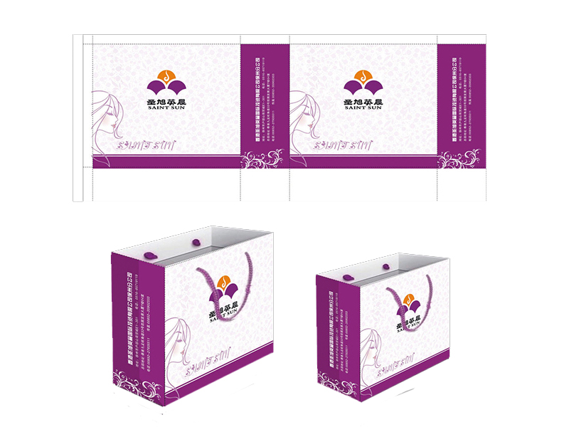
 濟(jì)南華政印務(wù)有限公司
聯(lián)系電話(huà):13698644688
服務(wù)熱線(xiàn):13698644688
聯(lián)系地址:濟(jì)南市歷城區(qū)同華路1號(hào)
聲明:文章來(lái)源于http://m.ardmoreoilandgas.com/
 微信獲取報(bào)價(jià)